Pup Pantry
Choosing food for your dog should feel simple, but for many pet parents, it becomes a stressful chore that leaves them uncertain if they made the right choice.
Pup Pantry was designed to turn those moments of confusion into moments of confidence. By guiding dog parents through a personalized pet profile and narrowing down the countless options to a small, tailored list, the experience focuses on clarity instead of overload.
A personalized dog food recommendation experience.
The Problem
Dog owners want to feed their pets the best food, but choosing the “right food” is overwhelming. Ingredient lists are confusing, marketing claims are everywhere, and the number of options can feel endless.

Secondary Research

I began conducting secondary research to understand the decision-making process behind dog food selection.
The common obstacles for dog owners were:
These findings revealed that the challenge wasn't simply finding dog food. It was helping owners feel confident in their decision. This insight reinforced the need for personalized recommendations and simplified comparisons rather than a traditional shopping experience.

The common obstacles for dog owners were:
User Research
I interviewed 4 dog owners to understand what choosing food felt like for them. While they walked me through their food selection process, I paid close attention to their doubts, frustrations, and moments of hesitation. A consistent theme emerged: the decision to select the “right” food felt heavier than expected. Describing ingredient lists as being hard to interpret, skepticism of marketing claims, and uncertainty of where to find trusted guidance. Comparing food options often required opening multiple tabs and cross-checking information without feeling confident afterward.
The more conversations I had with dog owners, the more it became clear that the issue certainly was not the lack of food choices but instead the emotional weight of the decision itself. Pet parents weren’t just looking for more options; they were seeking clarity and reassurance to be confident in their choice of food for their furry friend.

Persona
From this research emerged Diana, the dog parent, a persona created to represent the emotionally invested pet owners who want the best for their pets but feel uncertain navigating endless brands, ingredients, and advice. Diana represented users who weren't looking for more food options—they were looking for reassurance and confidence in their decisions.

Minimal Viable Product
These features were prioritized because they directly addressed the most common frustrations uncovered during research: information overload, lack of personalized guidance, and difficulty comparing foods. Rather than overwhelming users with a surplus of food options, the focus became narrowing down those options into a manageable, personalized list. The design intentionally removed unnecessary shopping features and prioritized tools for the decision-making process. This guides users step-by-step through a complex process while keeping the experience clear, focused, and reassuring.

Designing for Diana meant identifying what she truly needed to confidently choose a dog food. After synthesizing research, four core needs emerged:

With Diana’s needs defined, I began sketching possible routes for onboarding, pet profile setup, recommendations, and food comparison. The goal was to explore how to guide users through the experience in a way that felt easy to understand and eliminated overwhelm.

Sketches
As I worked through these sketches, it became clear that a guided, structured flow best supported Diana’s need for reassurance and reduced overwhelm. Sketching these routes allowed me to quickly test layout decisions to explore different ways to reduce decision fatigue.

Low Fidelity Wireframes
After my sketches were complete, I moved into low-fidelity wireframes to evaluate flow, clarity, and potential friction points that dog owners using the app may face. The focus at this stage was on functionality and usability rather than visual polish.
While developing wireframes, several edge cases became apparent. Some users may not have an email address, so a “Continue with Phone Number” option was introduced. Additionally, fields such as age, breed, and weight required an “Unknown” option to accommodate users who may not have exact information.
Minor clarity adjustments were also made, including refining labels and adding a brief tutorial screen to help users understand how the Food Finder works. These changes ensured the experience remained accessible, intuitive, and easy to navigate before progressing to high-fidelity designs.
Branding
Wanting to establish a visual and emotional direction that best suited for Pup Pantry, I created a style guide. It was important to maintain an environment that was calm, supportive, and trustworthy for pet parents navigating complex nutrition decisions. The goal being to make nutritional guidance feel less intimidating and more like receiving advice from a knowledgeable and supportive friend.
Soon, it was time to begin the high-fidelity designs to bring the experience to life. Now the focus shifted from structure to how the interface would feel emotionally while maintaining the previously established clarity and usability.
I aimed for a minimal, yet still soft and comforting design. Clean and simple layouts with clear hierarchy were prioritized to keep screens from being cluttered as a way to alleviate overwhelm in the food decision-making experience. By incorporating softer accent colors, rounded buttons, and visually lighter icon styles, I kept the atmosphere from feeling too clinical.
The food recommendation screen was designed to present information in an easily digestible way, providing users with key features of each food without being too much to lead to overwhelm. The comparison feature, which was a core part of the experience, was designed to make a side-by-side nutritional evaluation feel simple and visually clear.
High Fidelity Designs
Usability Testing-Two Rounds
Once the high-fidelity designs were complete, I conducted two rounds of usability tests with 5 participants in each round. Participants were dog owners with prior experience purchasing products online and were asked to complete tasks, including account setup, pet profile creation, finding food recommendations, and comparing two dog foods. During the first round, a major usability issue emerged around the food comparison route, that being:

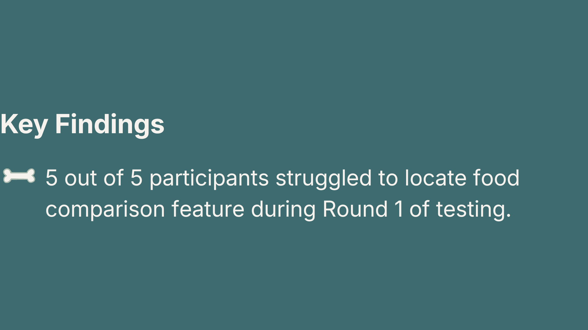
The original comparison flow required users to navigate through "Bella's Food," select previously liked foods, and then proceed through a customizable comparison setup screen before reaching the side-by-side comparison. This multi-step process created confusion and slowed task completion.

During Round 2 testing, all 5 participants successfully located and completed the comparison task without hesitation or confusion.
These changes simplified the comparison workflow, improved discoverability, and reduced the number of steps required to compare food options.
Iterations
Based on the hesitation and requests for a faster path, I changed the phrasing from “Bella’s Food” to “Compare Food” and removed the customization step entirely. The side-by-side comparison page was constantly well-received, as users felt like it contained all the necessary information without anything missing.
Additionally, I addressed another user's concern regarding where the food could be purchased. A “Where to Buy” section was added to individual dog food pages, including retail options and pricing.
Through these refinements, the updated design became more intuitive, easier to navigate, and more aligned with the goal of helping users make a confident and informed pet food decision.
Reflection
If given more time, I would conduct one additional round of usability tests across all core routes to validate the clarity of the pet profile and food recommendation experience after the second round of refinements.
I would also explore adding an education page, potentially as part of the home page experience. Based on my secondary research, many dog owners seek trustworthy nutritional guidance. Including the design upgrades listed below would elevate Pup Pantry from being primarily a food recommendation tool to a more comprehensive support system for pet parents.
Design Upgrades:
Food transitions recommendations,
WSAVA nutritional guidelines
Current pet food recall information