House2Home
Designing a decor starter kit experience that helps people bring their ideal aesthetic to life.
The challenge
Users often know the aesthetic they want but struggle to find complementary decor pieces that fit both their style and budget.
Key Challenges
Users know the style they want, but struggle to coordinate decor pieces
Thousands of home decor options create decision fatigue.
Opportunity
House2Home would like to explore curated decor starter kits that bundle complementary items, helping users confidently bring their desired aesthetic to life.
This project was completed as a modified version of Google Ventures 5-Day Design Sprint, a rapid design framework.
Goal
The first day of the design sprint focused on understanding how users approach shopping for decorations.
Day 1: Problem Mapping
Research Insight
People already have a clear vision of the aesthetic they want for their home, but struggle to translate that vision into specific decor choices that work well together.
These journey maps revealed that users weren’t struggling with a lack of inspiration; they were struggling with turning that inspiration into action. Users often knew the style direction they wanted to take but felt overwhelmed by coordinating products, staying within budget, and figuring out which pieces went together. This insight reinforced the opportunity for curated decor starter kits, as they would simplify the decision-making process while still preserving the user’s choice.
Map 1
Map 2
Map 3
Day 2: Sketching
Goal
The second day focused on generating potential layouts for the selected route identified on day 1.
Inspiration Research
I reviewed home furnishing sites, such as Wayfair and IKEA, to better understand common website layouts, browsing patterns and shopping experiences.
After gathering sufficient inspiration, I completed a Crazy 8s exercise to quickly explore multiple layout ideas for what would be the critical screen of the route. From these sketches and rapid ideation techniques, several concepts revolving around product browsing, the strongest ideas bringing visual inspiration and guided decision-making. Making it easy to select the strongest layout concept that reduces choice overload while still keeping the user focused on achieving their desired aesthetic.
Crazy 8’s
3-Panel Storyboard
Day 3: Decide
Goal
Deciding the type of flow that best addresses the user’s needs.
Rather than asking users to browse hundreds of products individually, the selected flow narrowed choices into curated kits grouped together by aesthetic, simplifying the process of choosing cohesive decor within a budget, addressing the key problem.
I expanded the selected concept from 3 panels to a full storyboard that mapped the core user journey from landing on the House2Home homepage, discovering what a decor kit is, browsing starter kits, reviewing the kit details, and completing the entire checkout process.
Decision
Selected an inspiration-based starter kit flow that grouped products by aesthetic.
Day 4: Prototyping
Goal
Create a realistic prototype of House2Home that evaluates the starter kit experience.
The prototype was designed to test whether curated decor kits, visual styling examples, and bundled product information could increase user confidence during the decorating process. Each screen focused on helping users understand what was included in a kit, visualize how pieces worked together, and evaluate whether the kit matched their style and budget.
Day 5: Test
Goal
On the final day of the design sprint, I focused on evaluating whether users could successfully browse, understand, and purchase a decor kit.
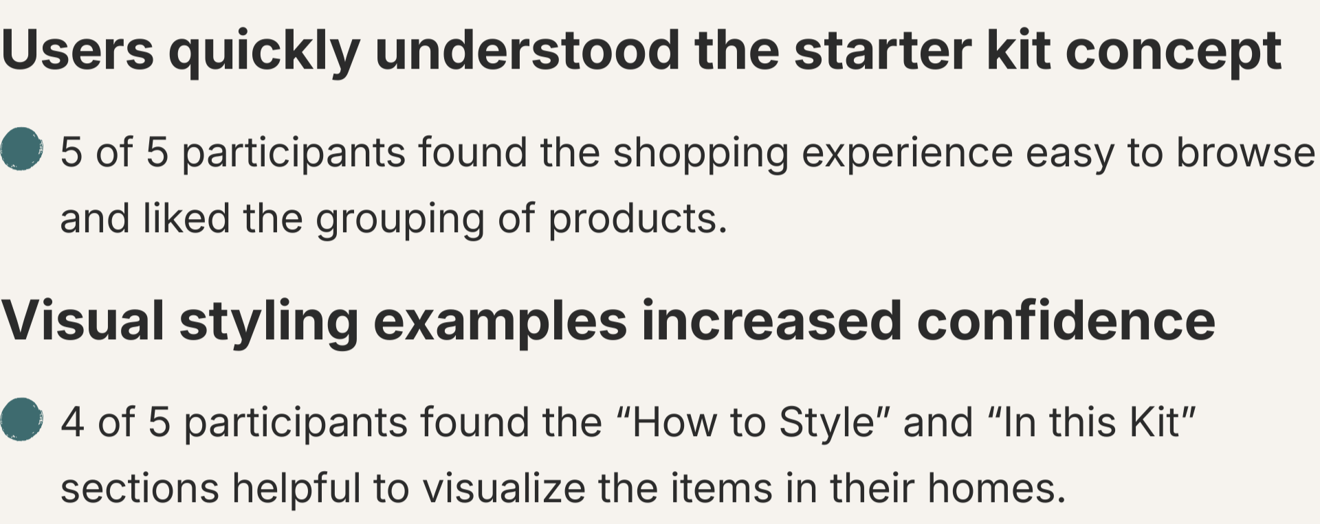
I conducted usability tests with 5 participants who regularly shop online and had experience decorating a new home or apartment within the last five years. Each participant was given the same scenario and asked to explore the House2Home prototype to browse decor starter kits in an attempt to purchase one.
Key Findings
Iteration
Goal
Refine the House2Home design based on usability tests to improve clarity and reduce friction within the user flow.
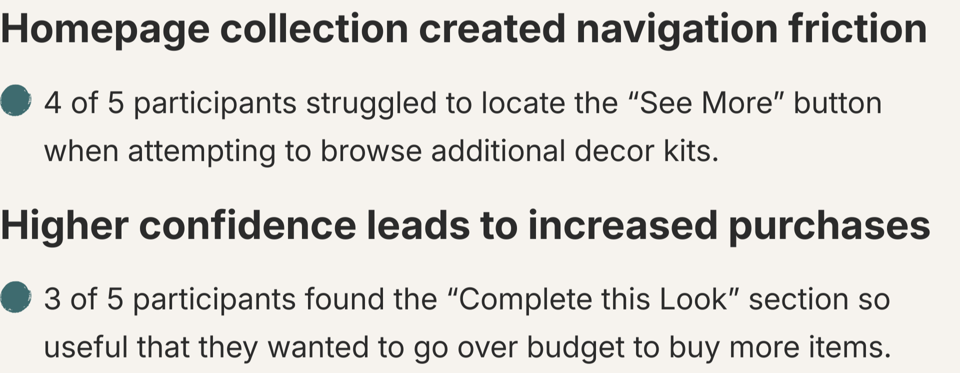
80% of participants hesitated or struggled to identify the “See More” button to browse additional decor kits. To improve discoverability, I made the button more visually prominent and repositioned it to a more intuitive location.
Participants had also suggested improvements to the checkout process. I added an additional address field to accommodate users who live in apartments. A distinction between billing and shipping addresses was also made to improve clarity. The confirmation screen was also updated, now displaying an order number and a message informing customers that a confirmation email has been sent to them.
Reflection
This design sprint demonstrated how quickly ideation, prototyping, and usability testing can validate important design decisions. Testing confirmed that users easily understood the concept of decor start kits and that features like “In This Kit” and “How To Style” helped users visualize how the items may come together in different rooms within their household.
Future improvements for this project would include adding a reviews section on the product page so users can view real feedback on the kits. As well as creating a “saved items” or “hearted” section on the main menu to help users revisit and compare options. These improvements would build trust and further reduce friction in the decision-making process.