Cycle Savvy
Finding the right bike, even for an experienced cyclist, is not simple. Users can be easily overwhelmed by too many options, cluttered layouts, unclear product differences, and a frustrating checkout experience.
CycleSavvy is an e-commerce company that sells high-quality bikes to research-driven cyclists through its mobile-web experience.
The Problem
CycleSavvy recently identified a high drop-off rate after users viewed multiple product pages. There was also another significant site abandonment issue during the checkout experience, suggesting an account creation issue.
To address these challenges, I enhanced the shoppers' experience through streamlining the browsing and checkout experience to support confident decision-making. Catering to the experienced cyclists’ core needs of simplified layouts with optimal information, critical filtering options, and reducing friction in the checkout experience.
Project Planning
To approach this efficiently, I structured the project into six key phases: Discovery, Design, and Validation. After creating a clear foundation and understanding of the current problem space and user behaviors, I moved into the design phase, followed by iterative testing and refinement. Ultimately ending with the final high-fidelity prototyped design.

Competitive & Secondary Research
To better understand the problem space, I conducted a competitive analysis of Target, Amazon, and Trekbikes. This allowed me to evaluate how users navigate bike shopping experiences and how existing companies address cyclist-specific needs.
Through competitive analysis, I identified common challenges users face and how different companies address them. Specifically in areas of the shopping experience, like product comparison, information clarity, and overall browsing experience.
To further deepen my insight into user behavior when purchasing high-cost products, I complemented this with secondary research. I focused on decision-making, site abandonment, and Cyclist-specific shopping behaviors.
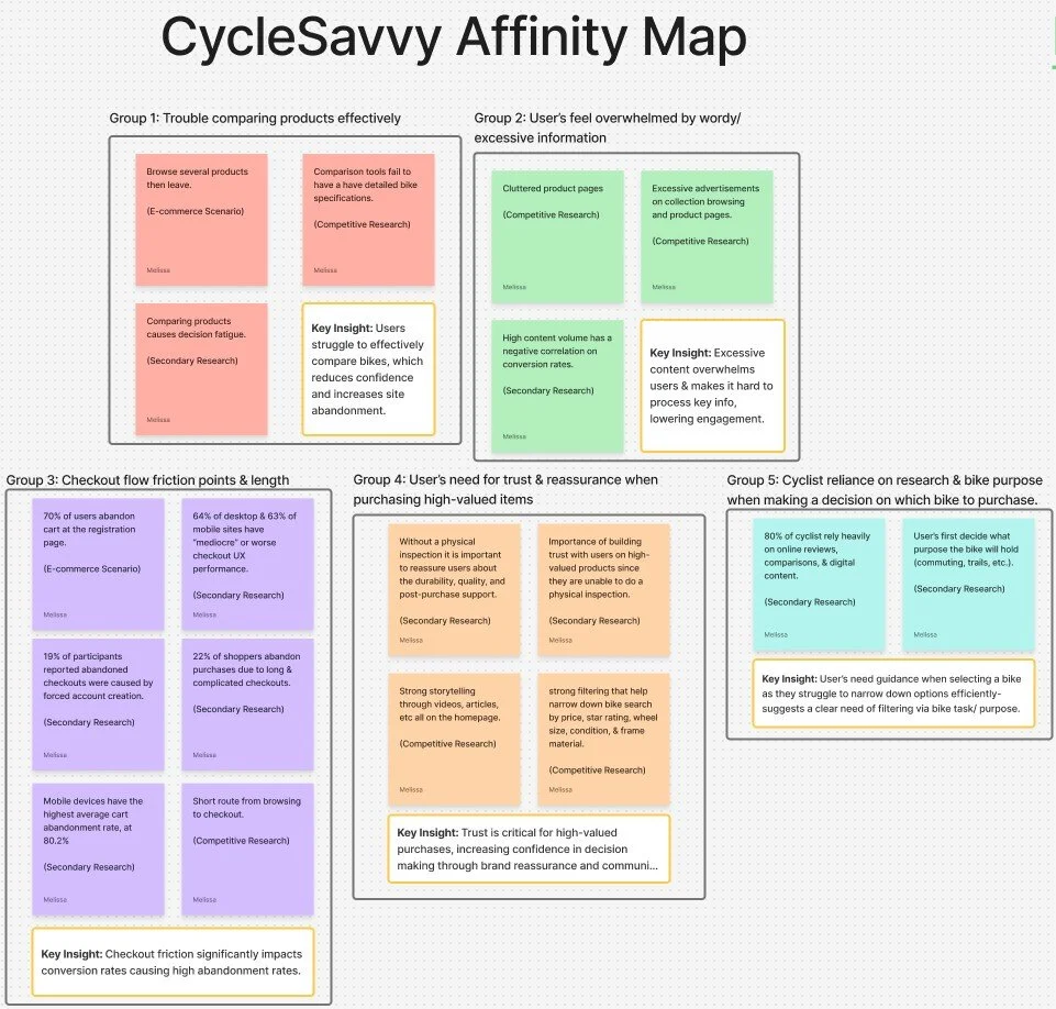
Research Synthesis- Affinity Map & Persona
To make sense of my research, I translated my findings into an affinity map and a persona. The affinity map helped expose patterns across users' behaviors and experiences. While the persona grounded those insights in a specific, research-driven audience, to ensure design decisions remain focused. Utilizing these patterns and persona to guide actionable changes in the design.
Across both competitive and secondary research, a clear pattern emerged: users struggle to confidently find the best bike that fits their needs. This is due to difficulty comparing items and navigating overwhelming product and collection pages. Cluttered layouts and dense product information make it hard to identify key information, increasing cognitive load.
Friction extended through the checkout process, particularly for mobile users. Long checkout routes and forced account creation introduced barriers at critical decision-making points, contributing to site abandonment.
Together, these insights highlighted the need for clear decision-making tools, reduced friction, and building trust with users throughout their experience. This steered my design direction toward comparison tools, streamlining the checkout process, and reinforcing the user’s confidence through clear item information and community feedback.

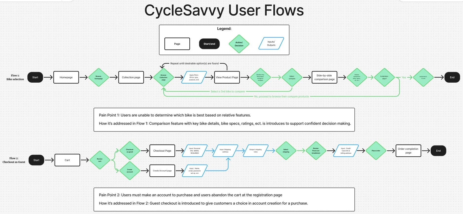
Information Architecture- User Flows
Once I clearly understood the problem space and user needs, I mapped out key user flow routes. I visualized how users move through the experience, specifically red routes, like the product discovery, product comparison, and checkout.
Once the pain points in the flow were identified, I began aligning users' needs from my research with actionable solutions. Intentionally implementing these features where they would have the greatest impact. By simplifying navigation, supporting product comparison, and accommodating guest checkout, the updated flow becomes more intuitive from browsing to purchase. Ultimately, alleviating overwhelm by creating a smoother browsing experience and supporting confident decision-making in a way that feels natural to the user's shopping experience.
Low Fidelity Wireframes
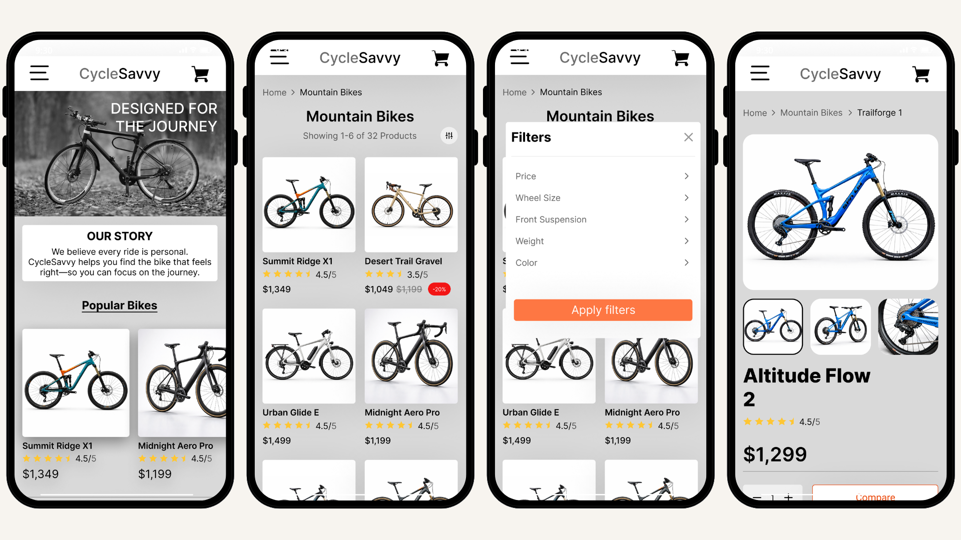
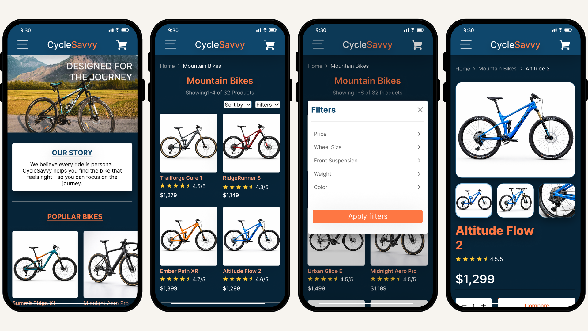
Guided by my research insights and persona, I explored early design solutions through low-fidelity wireframes. Focusing on simplifying browsing and product page layout without sacrificing essential information. Detailed information is crucial for a high-value purchase, especially for the desired audience that is research-driven.
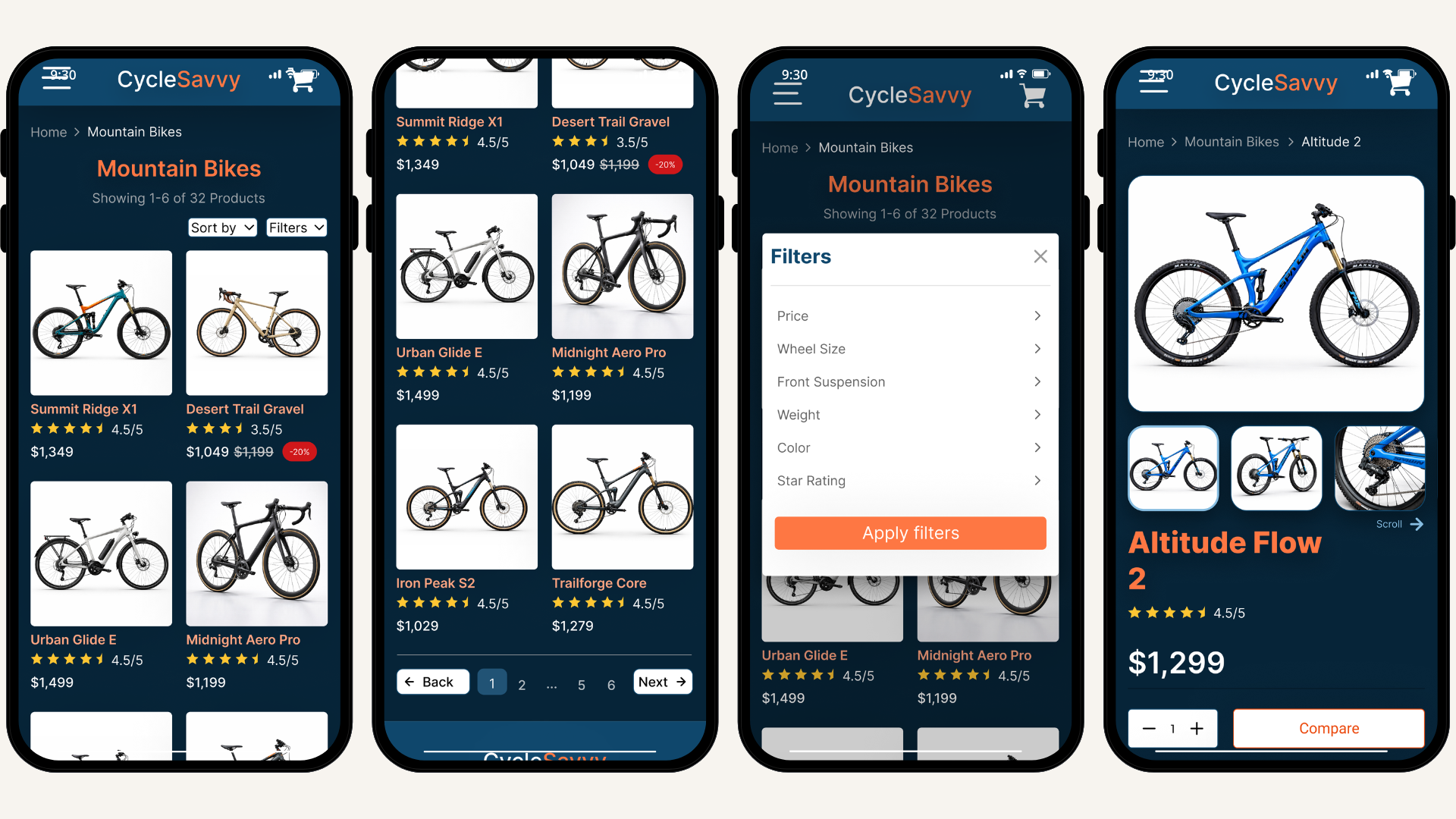
Implementing filtering options on browsing pages allows users to quickly navigate through products and reduces cognitive load. Niche bike filters were introduced into the low-fidelity design to help users quickly narrow down options to a specific type of bike, based on preferences.
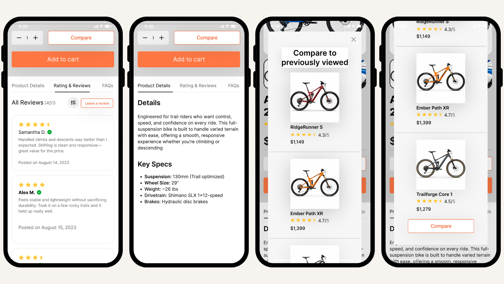
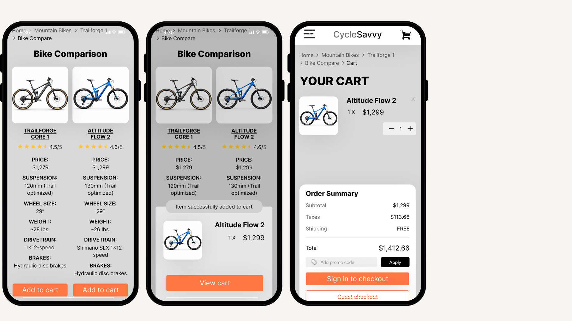
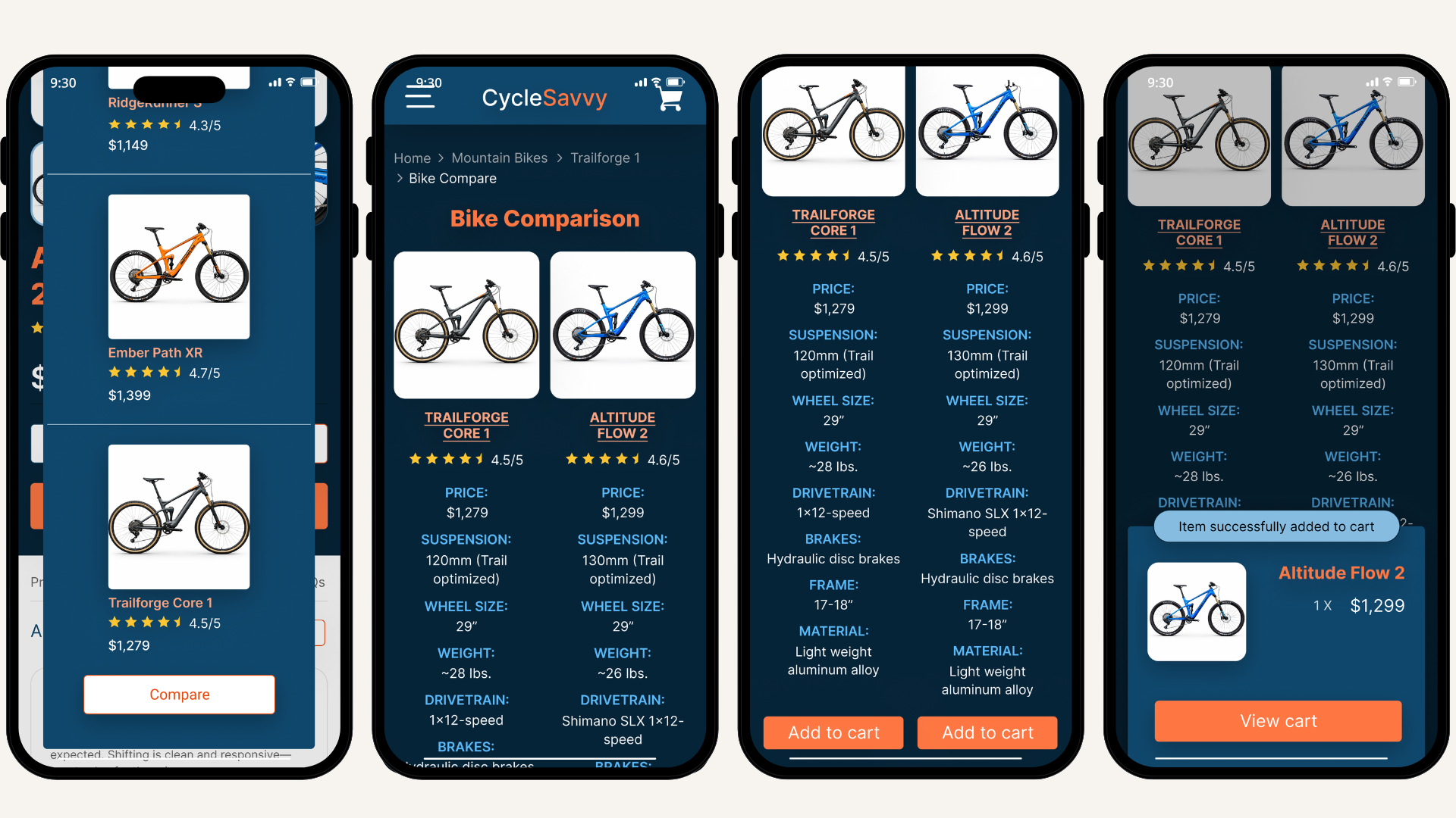
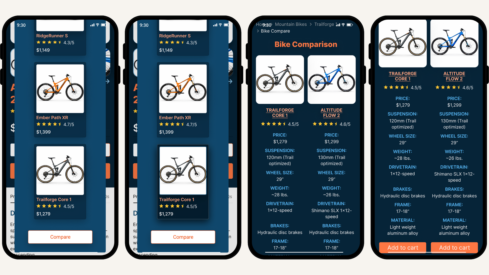
A product comparison feature was a key addition, enabling users to evaluate detailed bike specifications between similar products without leaving the site. By eliminating the need to switch between multiple pages, it provides the user with everything they would need to compare key product details, all in one place.
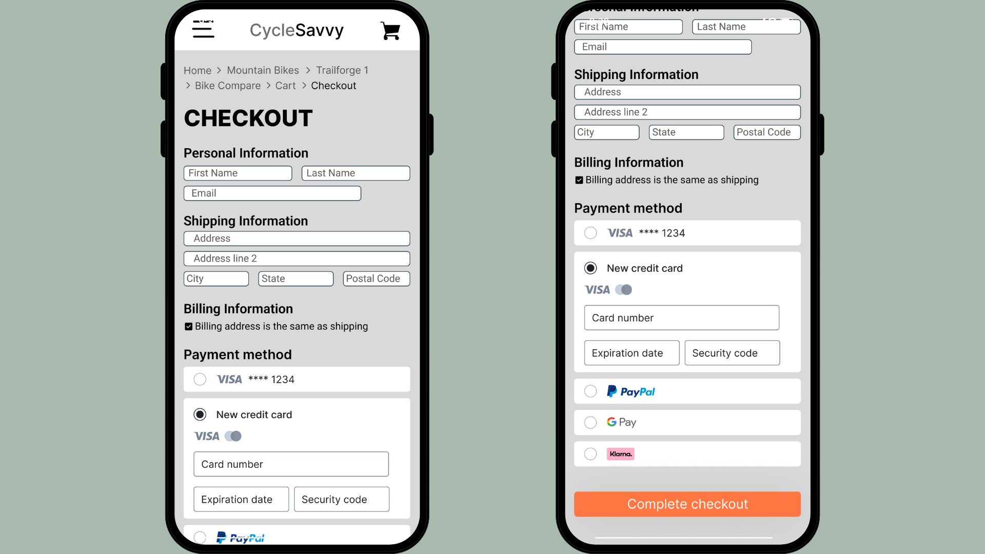
Lastly, creating a guest checkout was introduced to remove unnecessary friction at the point of commitment. By giving users the choice to create an account, the experience becomes more flexible and welcoming. This boosts the user’s trust in CycleSavvy, while reducing friction during a high-commitment moment.
Usability Testing Round One
My low-fidelity wireframes served as a foundation for testing core functionality and validating early design decisions. The first round of usability testing included five participants, all familiar with making high-cost purchases online.
While users overall were able to navigate through the experience, testing revealed additional friction during the checkout process. Three out of 5 participants expressed wanting multiple shipping options available. They noted that they would be willing to pay additional expenses to get the desired bike faster.
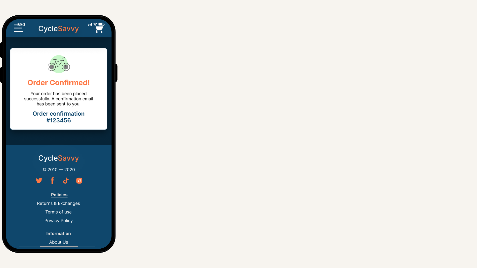
At the point of payment, two users hesitated due to poor cost visibility and often questioned “How much was the bike again?” This indicated a need for price reinforcement at the final point of commitment. Finally, the majority of participants requested an order confirmation message following checkout, to provide reassurance in the purchase.
High Fidelity Wireframes
Taking my findings from the initial round of usability tests, I refined my design to address key friction points. These updates focused on improving clarity, supporting critical decision-making moments, and reinforcing trust.
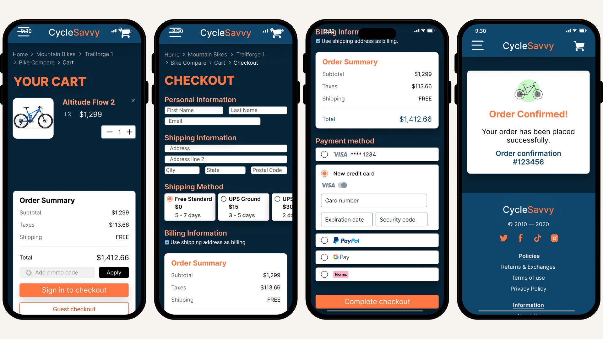
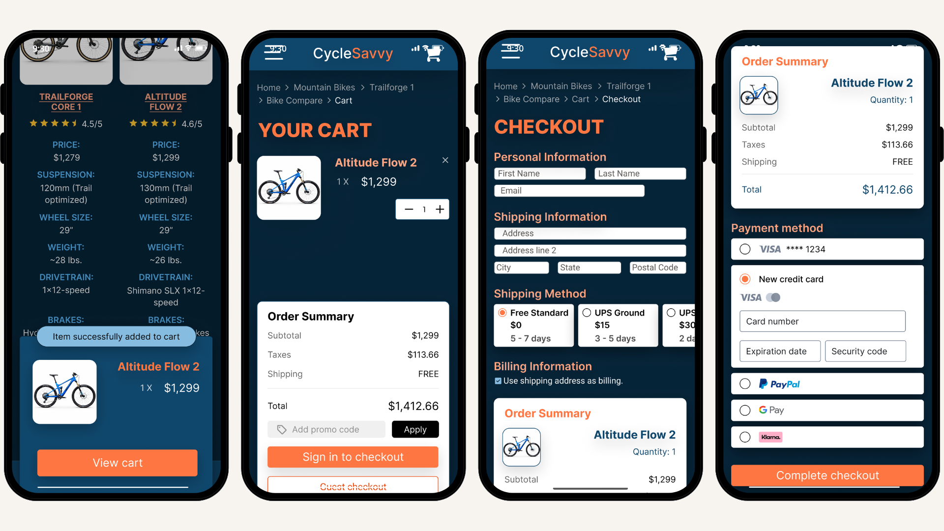
To reduce hesitation, multiple shipping methods were introduced with clearly displayed costs on the checkout page. Before payment entry, the user is given an additional order summary, which allows users to review item cost, taxes, and shipping expenses before committing to the purchase.
To further build confidence, a confirmation page was introduced after checkout. This provided immediate feedback in the form of a success message confirming the purchase with an order confirmation number to reassure the user and boost trust.
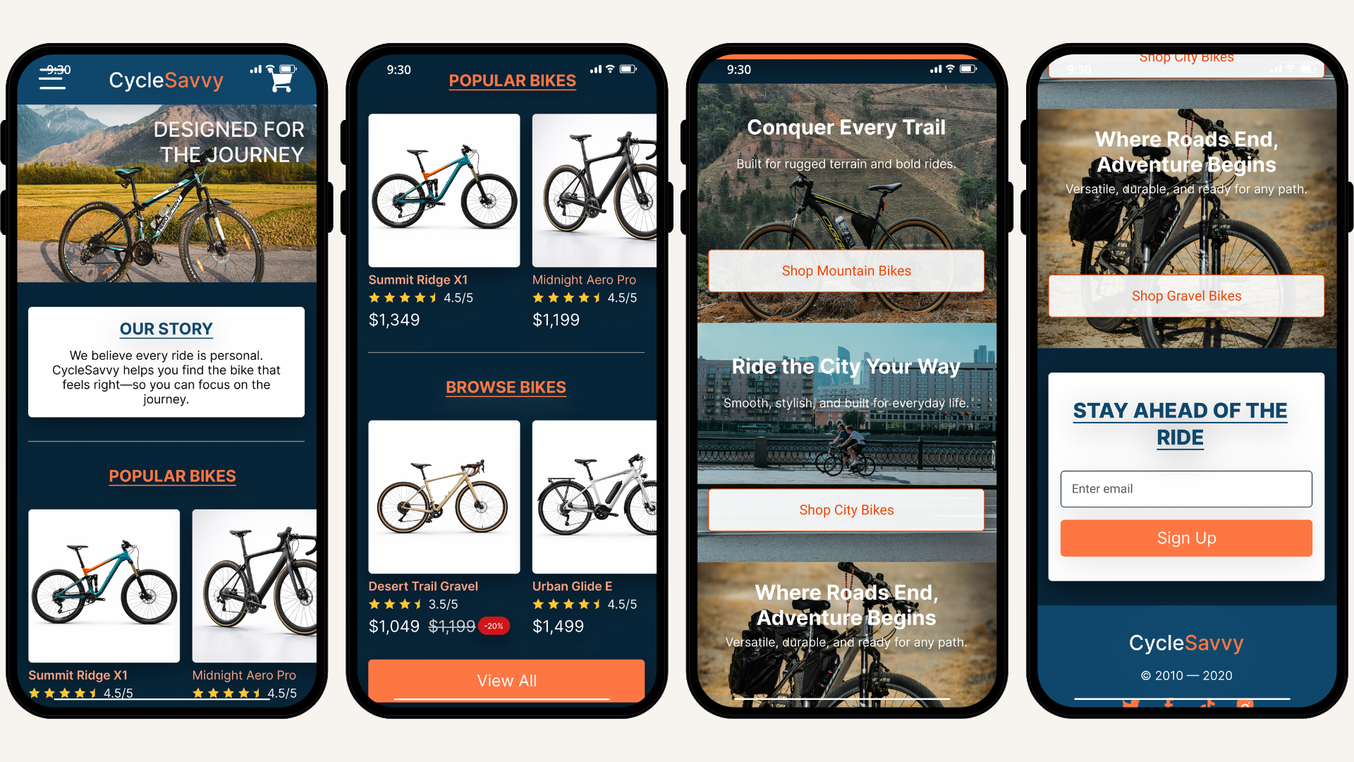
In addition to functionality improvements, visual design played a pivotal role in shaping the user's overall experience with CycleSavvy. The company’s color palette was applied to reflect the brand's focused and performance-driven personality while maintaining a clean and intuitive interface. Strategic color incorporation gave life to the storytelling and dependable experience of each route. This elevated the experience of the flow from functional to a cohesive high-fidelity prototype.
Usability Testing Round Two
After refining the high-fidelity prototype, I conducted a second round of usability testing with 5 participants familiar with high-cost purchases. To better reflect CycleSavvy’s audience, the majority of the participants were male, aligning with the 72% male demographic. Testing focused on product browsing, comparison functionality, and validating checkout improvements.
Overall, users responded positively to the updated experience. Detailed filters were especially well received, with participants noting how efficiently they were able to narrow down options. On the product pages, customer reviews, simplified layouts, detailed specifications, and the addition of a manufacturer's video improved product clarity and engagement. However, the placement of the video in the product details created confusion, as most users felt the media was out of place.
The comparison feature was revealed to be a more critical issue. When prompted to select a bike to compare, users skipped the selection step and proceeded to the “compare” action. This pattern was consistent across all participants, indicating that this was a critical issue regarding interaction clarity.
While checkout improvements reduced some friction, specifically with the shipping methods, there was still hesitation at the final point of commitment. Even with the order summary, users still sought additional reassurance. Often wanting to reconfirm the product name or view a photo of the bike before completing their purchase. This behavior suggests that additional validation is needed to support user confidence at the final step of purchase.
Final High Fidelity Wireframes
Using insight from the second usability test, I began refining my high-fidelity wireframe designs a final time. These final iterations were concentrated on improving interaction clarity, informational hierarchy, and reinforcing user confidence during the checkout process.
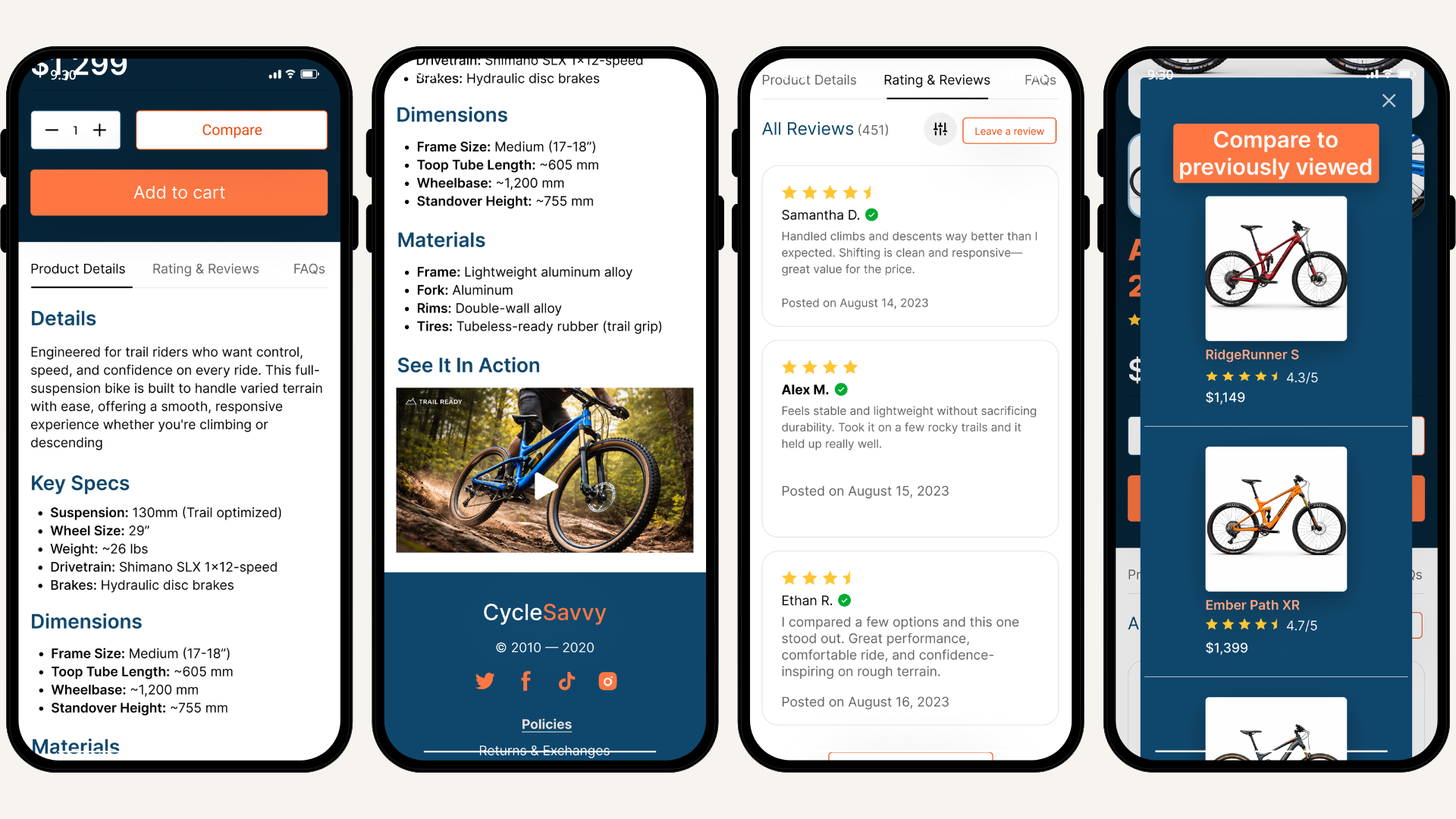
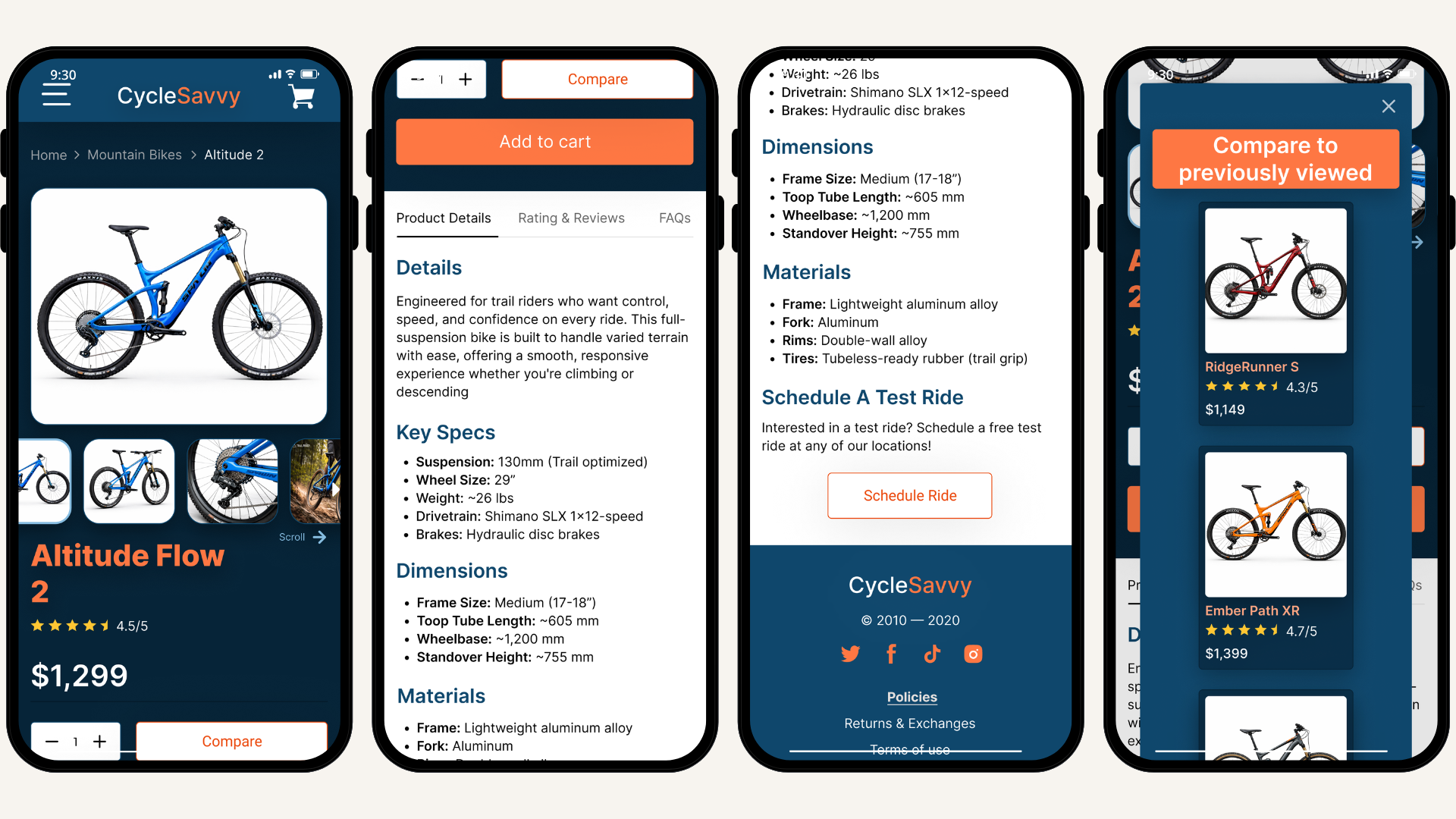
On the product page, the manufacturer’s video was relocated to align with user expectations. I introduced a media carousel to integrate the video, without disrupting the well-received layout. I equipped the image carousel with arrow icons, as well as kept the part of the video visible to indicate that a scrolling action was needed to view additional content.
To address the confusion in the comparison flow, I placed each bike on its own individual product card. This made a distinction that each bike was held in a separate selection before the comparison action. To further clarify interaction, visual feedback was introduced, now selected bikes will darken to indicate an active selection.
Within the checkout experience, additional cues were implemented to reduce hesitation at the final point of commitment. A product image of the selected bike and the name were incorporated into the order summary. This reassures the user of their selection and boosts purchase confidence in the selected item.
Reflection
This project challenged me to move beyond the simple organization of research and focus on synthesizing insights into meaningful design solutions. Learning to identify patterns across different research methods and translate them into viable solutions that not only improve usability but also support user confidence.
Balancing the level of detail required for a research-driven cyclist while preventing decision fatigue proved especially challenging. I had to be intentional about the content and how it was presented, ensuring users could access important specifications without feeling overwhelmed. Establishing a clear informational hierarchy became key to creating a cohesive design that maintained both clarity and engagement.
If I were to continue this project, I would explore the comparison features further, as the final usability tests revealed some confusion within that flow. I would also conduct an additional round of usability testing with participants who identify as research-driven. This would provide better insight into how a research-oriented user would interact with this design experience.